What happened...
A lot has changed in the past decade in the world of web design.
People started replacing desktops with laptops. The laptop screens got wider then were replaced with tablets. Pixels became more and more abundant. Screens then got smaller with smartphones and then bigger, much bigger with 50 inch Internet enabled TVs.
Then we had new browsers for smartphones. New desktop browsers like Chrome that displays 25% larger than Internet Explorer or Edge. It got diverse, less vanilla.
What we do...
There are essentially two approaches to the problem. Building and maintaining two websites, one for small screens such as a smart phone and one for larger screens such as large laptop or TV.
Obviously this is twice as much work and will cost twice as much.
The second solution is to have one website but to overlay a "mobile" style when displayed on a smaller screen. This is what we do and provides an affordable solution.
Responsive Web Design with CMS
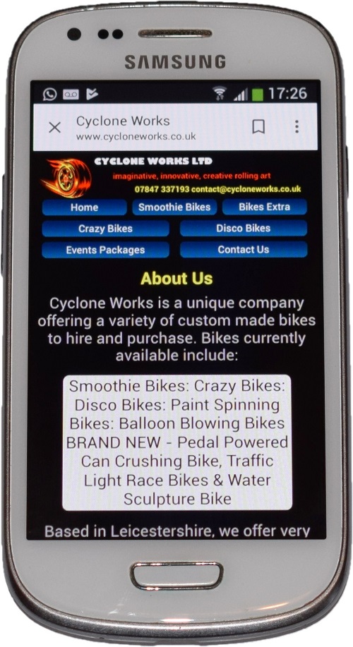
So the webites we build are elastic and responsive. They adapt. They stretch to fill the space available and allow you to press a phone number on the website to make a call.
Your website might display in three columns across on a desktop but on a smartphone you just keep scrolling down. It works out what's best for you.
You get a Content Management System (CMS) too, a really simple one. So if you want to change the text on your website or maybe upload an image of a special offer you can do it yourself without having to pay a developer.